
The Aim of the game is to practice painting natural things digitally without using any tracing, rotoscoping, filters and all that jargon, just good old still life observation :)
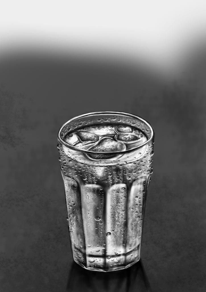 Fig.01
The Process.
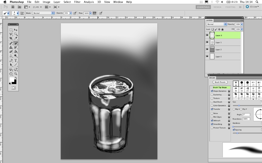 Fig.02
I started off by making simple gesture lines to pick out the form of the glass and the ice cubes, also some block reflection on the water. These were in separate layers to enable me to turn them off once they were no longer needed.
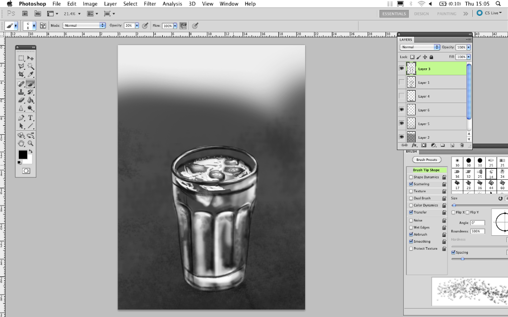 Fig.03
Here I used the scattering on a brush to put grain into the background. I wanted to create the effect that the background went out of focus to bring the glass into a crisp foreground.
The glass in this image, I created a new layer and worked over the top of my outlines with white to start getting some dimension.
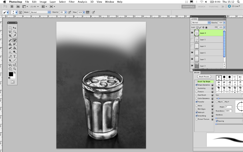 Fig.04
Some shadow on the table surface was added, also some black scatter in the glass to get some grainy texture started.
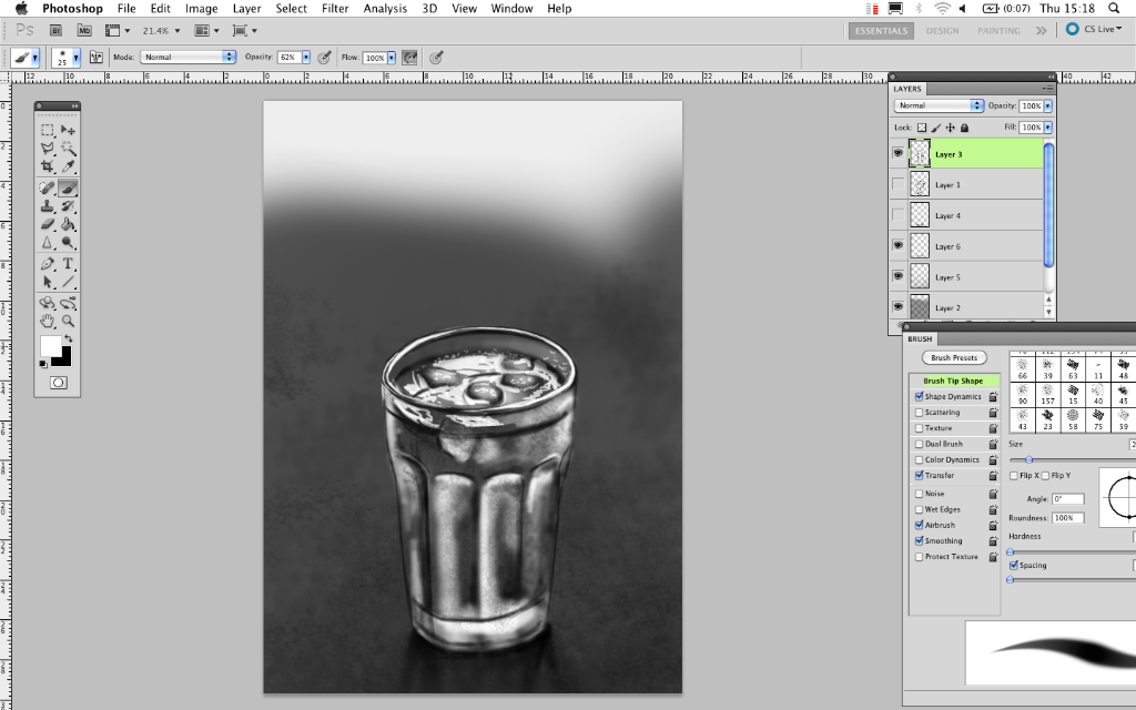 Fig.05
Here I started working in some highlights. For example the top rim of the glass needed a lot of white to show the daylight that was hitting it from the window.
 Fig.06
Now this is the point I began to put the condensation on. I noticed that the lighter parts of the water droplets were actually at the bottom and the dark parts at the top where the water turns the actual lighting upside down. I found that when I put these bits of condensation on the glass it was bringing it to life. Giving it a realistic feel.
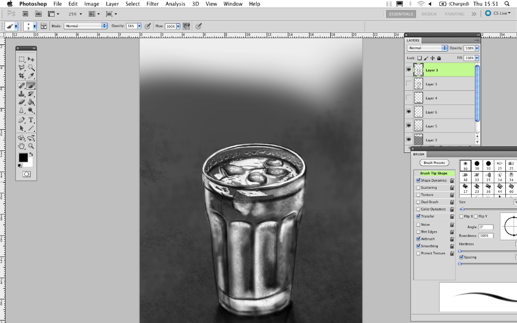 Fig.07
It's important to make sure the highlights and shadows aren't too overpowering. In some areas it is necessary to give depth but too much of that can cause an opposite effect and make it look fake. With the condensation I made sure the white stood out more than the countering black and this seemed to work for realistic purposes.
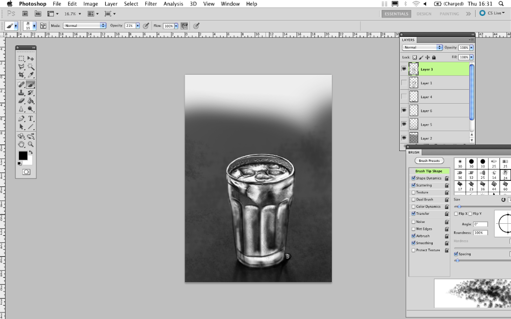 Fig.08
As I was looking at the glass I noticed how much condensation was starting to gather on the black paper below, and as I had to keep re-icing my glass of course the pool on the paper grew. I played with the idea of adding this into the image but later decided against it. Also at this stage I thought I needed to put some more Iceberg effect in the glass so the ice wasn't alone on the surface but it had some body underneath the water. So I blocked out some white to work into. Another important section is the reflection of the condensation on the surface of the water.
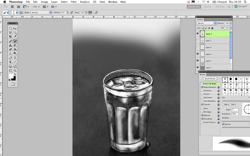 Fig.09
These chunks of white now needed some texture and shading so I noticed the cubes were quite grey looking around the edges where they were melting. I tried to show this.
Then I replaced the dark line where the water level lay.
 Fig.10
Then to fill the glass a little more I enlarged the part of ice floating above the surface of the water and tried to give the impression they were part of the submerged blocks of ice.
 Fig.11
I used a simple thin brush with varied opacities to add some detail.
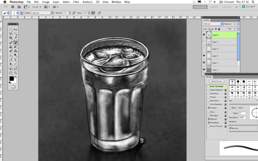 Fig.12
After getting the top section of the glass to a stage where it was almost finished, I began working into the shape of the left side of the glass. Looking at the lights and darks. Also the frostiness that comes across around the condensation droplets.
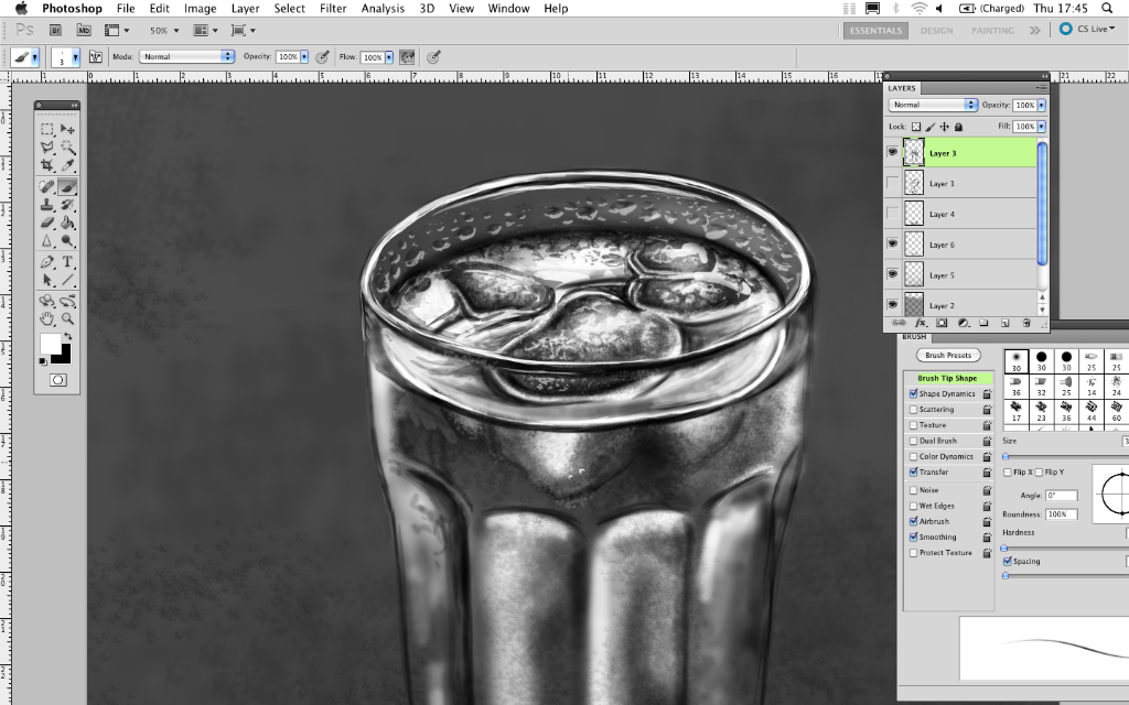 Fig.13
I know its only a tiny detail in the scheme of this painting but here I added a few bubbles onto the parts of the ice under the water, I noticed every time ice is quite fresh into a liquid it shows some tiny thick bubbles attached to it. Its this kind of detail I find very satisfying.
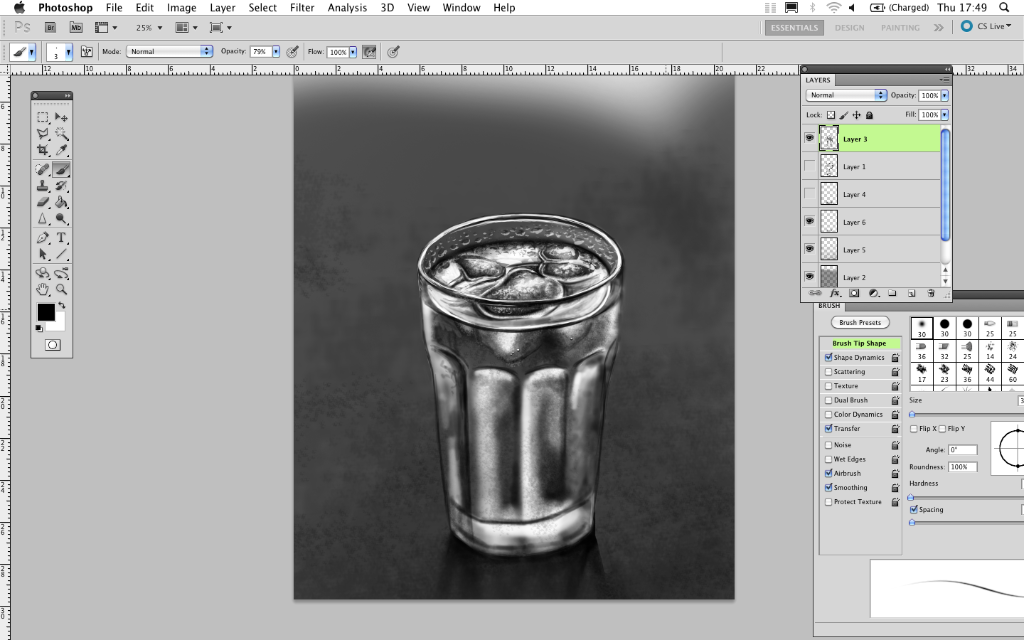 Fig.14
It's very important also to step back from the work as you're going along to get fresh view points. Having your face so close to the screen for the whole duration that you think you have added frostiness to the glass but it actually being the condensation of your breath on the screen is no good to anybody.
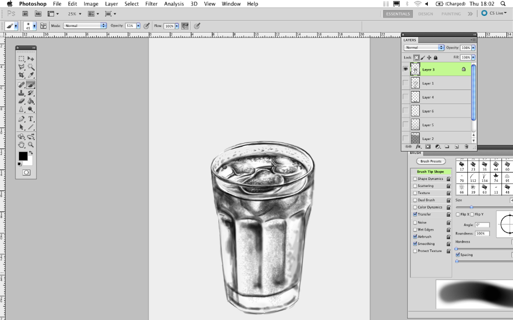 Fig.15
Here I hid the background layer to see what my glass layer looked like on its own, I find this useful incase it shows up some things that need working into but couldn't be seen because of an optical illusion from the colour of the background.
 Fig.16
Next some more condensation on the side if the glass. As this is all in one main layer I made sure I had the look I wanted in the glass before painting over with the droplets. Otherwise it would be very awkward to fix anything underneath these. Of course the option is there to make several layers so this isn't an issue, but this is how I made this particular image.
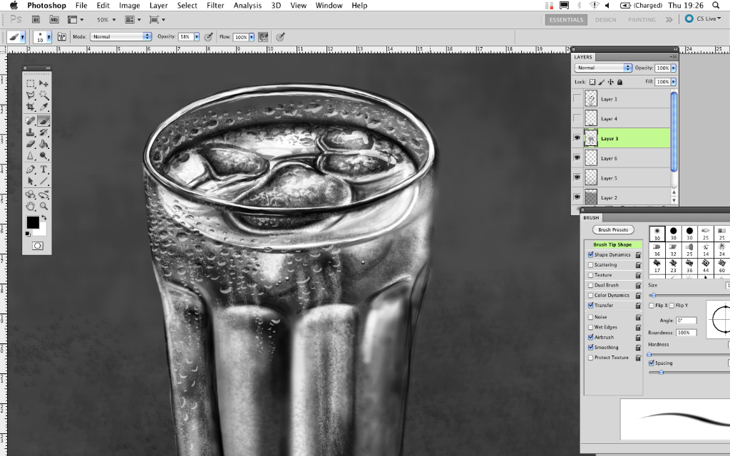 Fig.17
Another detail I tried to replicate was the look of when condensation has built up to a point that it then runs and leaves some clear lines down the glass. To get this effect I used a very small brush size, and scattered it, then painted in imperfect lines down the glass, so it looked like the very fine forms of condensation that looks frosty.
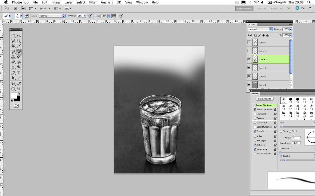 Fig.18
Again more condensation droplets, starting with an almost smile shape in white followed by a lighter opacity black to form the rest of the drop.
 Fig.19
Next I worked into the shape of the rest of the glass. Until this point it was still based on the beginning sketch.
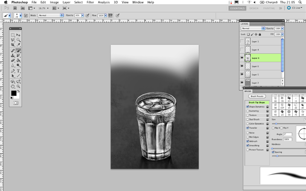 Fig.20
Here I have worked in some more white highlights within the rest of the glass, also created some more frosting.
 Fig.21
And of course the condensation droplets over the remainder of the glass. Another interesting thing I found in my observation, where the bottom of the glass had a lot of light reflecting around it because the glass is so thick it looked white, the water droplets that were viable over this section in the image had opposite colour tones to the rest of the droplets, so where the bottom of the glass was white the water droplet was white on the top and the shading for it was at the bottom. I find the way light bounces through water and how it turns things upside down fascinating.
 Fig.22
When I knew I was almost finished I sat back and thought what other details it needed to really bring it to life. This is the point where a few droplets on the sides of the glass happened. So it didn't look so flat.
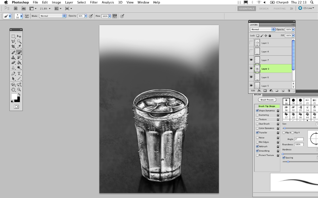 Fig.23
Of course some trial and error happened here as some I thought looked too big and couldn't get the image of the glass having large warts growing from the side of it, so I reduced some sizes and made them back into delicate little droplets of chilled water.
I'm still unsure of the bottom right side of the glass. But I find if I leave an image for a few days and come back to it I might be able to see what I couldn't previously.


